Responsive Design 2025: New Standards Beyond Mobile-First
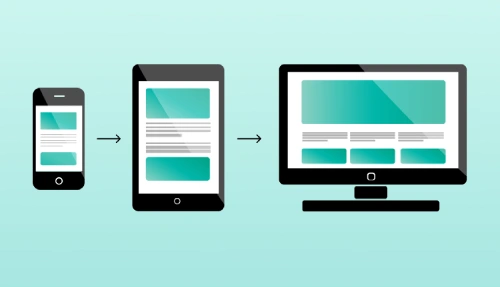
In the last decade, “mobile-first design” became the standard for every website. But as we enter 2025, the digital world has changed dramatically. Users are no longer browsing only on mobiles or desktops they’re using smart TVs, tablets, foldable screens, VR/AR devices, watches, and even in-car screens. This shift has created a need for something bigger and more adaptive than mobile-first.
At CodeFormats, we now follow a more powerful approach: Experience-First Responsive Design a design system built for all screen types, all contexts, and all user behaviors.
This blog explains the new 2025 standards that go beyond mobile-first and how your website can stay modern, flexible, and future-ready.
1. The Limitations of Traditional Mobile-First Design
Mobile-first was revolutionary when most traffic came from smartphones. But in 2025, user interaction happens everywhere. Traditional mobile-first has limitations such as:
Tablets and foldable devices behave differently from mobiles.
Ultra-wide screens need different layouts.
Smart TV users need larger touch targets.
Desktop users still expect rich features and horizontal layouts.
Simply shrinking or expanding content is not enough anymore.
At CodeFormats, we focus on designing experiences, not just breakpoints.
2. The New Standard: Experience-First Responsive Design
The 2025 approach focuses on how users interact rather than which device they use.
Experience-first design includes:
Behavior-based layouts
Context-aware components
Adaptive UI elements
Touch, click, gesture & voice compatibility
Dynamic resizing for foldable devices
Instead of thinking “mobile-first,” designers now think “user-first, context-first.”
3. Adaptive Layouts for Foldable & Multi-Screen Devices
Foldable devices are one of the fastest-growing categories in 2025. Traditional breakpoints don’t work because the screen can change shape instantly.
New standards include:
Re-flowing layouts on fold
Dual-screen navigation
Multi-window support
Automatically resizing content areas
At CodeFormats, we design flexible grids that re-adjust instantly whenever a user opens, folds, or rotates their device.
4. Responsive Design for Large Screens & Smart TVs
Large screens are becoming common in homes and offices. In 2025, websites must:
Support 4K/8K screen sizes
Use wide, clean grid layouts
Provide large padding and comfortable spacing
Ensure text readability from a distance
Our team at CodeFormats focuses heavily on wide-screen optimization because businesses now display dashboards, websites, and presentations on large screens daily.
5. Touch, Gesture, and Voice-Friendly Interfaces
Responsive design is no longer just about width it’s also about input method.
New requirements include:
Touch-friendly buttons
Gesture-based navigation
Voice-search optimized UI
Larger tap zones
Simplified menus
At CodeFormats, we design websites with “multi-input compatibility,” so the user experience remains smooth on all types of interactions.
6. AI-Powered Responsive Adjustments
AI is becoming a key part of web design. In 2025, AI helps websites:
Rearrange content based on user behavior
Adjust font size automatically
Improve readability during night/day
Predict preferred layout
Load lighter UI on low internet speeds
We integrate AI-based optimizations at CodeFormats to give each visitor a personalized experience.
Conclusion
Responsive design has evolved far beyond the mobile-first era. In 2025, the web is multi-screen, multi-context, multi-input, and AI-driven. The new standards demand websites that adapt smoothly to every environment not just mobile and desktop.
At CodeFormats, we help businesses build future-ready, fast, modern, and fully adaptive websites using the latest 2025 responsive design practices.
If you want your website to stand out in the crowded digital world, remember: A truly responsive website is not just designed for devices it is designed for people.
FAQs — Responsive Design 2025
Q1. What is experience-first responsive design?
A: A design approach focused on user behavior and context, not just device size.
Q2. Why mobile-first is no longer enough in 2025?
A: Because users browse from foldables, TVs, tablets, desktops, and multi-screen devices.
Q3.Do responsive websites affect SEO?
A: Yes, Google ranks responsive, fast, and accessible websites higher.
Q4: How does CodeFormats help with responsive design?
A: We build modern, adaptive, and performance-optimized websites for all devices.
Facebook
LinkedIn
X
WhatsApp
Newsletter
Sign up our newsletter to get update information, news and free insight.


